Introduction to Logis Bootstrap Template
The Logis Bootstrap Template is a clean and professional design specifically tailored for logistics, transportation, and delivery companies. With its modern, responsive layout and simple navigation, this template is an excellent choice for businesses in the logistics sector looking to create a user-friendly and reliable online presence. It’s fully mobile-responsive and customizable to meet the needs of any logistics business.
Step-by-Step Guide to Implementing the Logis Bootstrap Template
Building a professional logistics website can be a breeze with the Logis Bootstrap Template. In this step-by-step guide, we'll walk you through the process of integrating the template into your business website, from setting up the basic structure to customizing the layout and content.
Step 1: Download and Setup the Logis Template
To begin using the Logis Bootstrap Template, you first need to download the template files or use the Bootstrap CDN for a faster setup.
1. Download the Template Files
You can download the Logis Bootstrap Template from various online repositories or template providers such as Start Bootstrap, BootstrapMade, or ThemeWagon. After downloading the template, unzip the files, and you’ll have access to the HTML, CSS, and JS files needed to implement the template.
2. Using Bootstrap CDN
If you prefer not to download files, you can add Bootstrap’s CDN to your HTML file. This method allows you to use Bootstrap’s grid system and components without downloading the entire framework. Add this code to your HTML head section:
html<!-- Bootstrap CSS -->
<link href="https://stackpath.bootstrapcdn.com/bootstrap/4.5.2/css/bootstrap.min.css" rel="stylesheet">
<!-- Bootstrap JS -->
<script src="https://stackpath.bootstrapcdn.com/bootstrap/4.5.2/js/bootstrap.bundle.min.js"></script>
This will load the necessary Bootstrap styles and functionality for your website.
Step 2: Build the Structure of the Website
Now that the Logis Bootstrap Template is set up, it’s time to start structuring your website. The Logis template is ideal for businesses in logistics, shipping, and transportation and typically includes essential sections such as the header, services, about us, and contact us.
1. Navigation Bar
The navigation bar is the main navigation tool that visitors use to move around your website. The Logis template provides a responsive, modern navigation bar that can be easily customized. Here’s an example of the navbar structure:
html<nav class="navbar navbar-expand-lg navbar-light bg-light fixed-top">
<a class="navbar-brand" href="#">Logis</a>
<button class="navbar-toggler" type="button" data-toggle="collapse" data-target="#navbarNav" aria-controls="navbarNav" aria-expanded="false" aria-label="Toggle navigation">
<span class="navbar-toggler-icon"></span>
</button>
<div class="collapse navbar-collapse" id="navbarNav">
<ul class="navbar-nav ml-auto">
<li class="nav-item active">
<a class="nav-link" href="#home">Home</a>
</li>
<li class="nav-item">
<a class="nav-link" href="#services">Services</a>
</li>
<li class="nav-item">
<a class="nav-link" href="#about">About</a>
</li>
<li class="nav-item">
<a class="nav-link" href="#contact">Contact</a>
</li>
</ul>
</div>
</nav>
In this code:
navbar-expand-lgensures the navbar expands for larger screens and collapses into a mobile-friendly version for smaller devices.fixed-topkeeps the navbar fixed at the top of the page, making it easy to navigate as users scroll down.
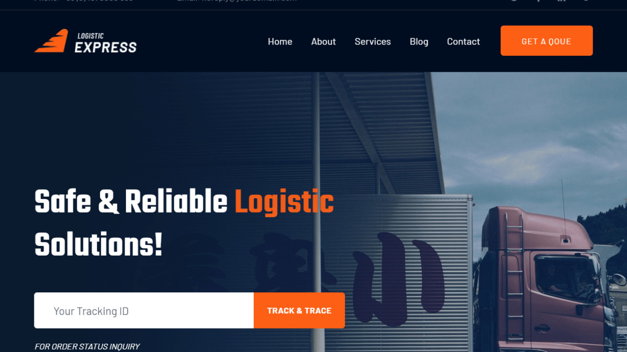
2. Hero Section
The hero section is the first thing users will see when visiting your site. This section often includes a call-to-action (CTA) button and an attention-grabbing background. You can use the following code to create a compelling hero section for your logistics website:
html<section id="home" class="hero bg-primary text-white text-center py-5">
<div class="container">
<h1 class="display-3">Reliable Logistics Services</h1>
<p class="lead">Get your goods delivered on time, every time.</p>
<a href="#services" class="btn btn-light btn-lg">Explore Our Services</a>
</div>
</section>
In this section:
bg-primaryapplies a primary background color to the section.text-whiteensures that the text is easy to read on a dark background.py-5adds padding to the top and bottom for a spacious layout.
Step 3: Add Key Sections for Content
Once you have the navigation and hero section set up, the next step is to add content-rich sections that will help your users understand your logistics services. Typical sections to include are services, about us, and contact us.
1. Services Section
In the services section, you can display the different logistics and transportation services you offer. Using Bootstrap’s grid system and card components, you can showcase your services clearly. Here's an example:
html<section id="services" class="services py-5">
<div class="container">
<h2 class="text-center">Our Services</h2>
<div class="row">
<div class="col-md-4">
<div class="card">
<img src="images/shipping.jpg" class="card-img-top" alt="Shipping Services">
<div class="card-body">
<h5 class="card-title">Shipping</h5>
<p class="card-text">Reliable shipping services to get your products to customers on time.</p>
</div>
</div>
</div>
<div class="col-md-4">
<div class="card">
<img src="images/transport.jpg" class="card-img-top" alt="Transport Services">
<div class="card-body">
<h5 class="card-title">Transport</h5>
<p class="card-text">We offer road, air, and sea transport for all kinds of cargo.</p>
</div>
</div>
</div>
<div class="col-md-4">
<div class="card">
<img src="images/storage.jpg" class="card-img-top" alt="Storage Services">
<div class="card-body">
<h5 class="card-title">Storage</h5>
<p class="card-text">Secure and accessible storage solutions for your goods.</p>
</div>
</div>
</div>
</div>
</div>
</section>
In this section, each service is displayed in its own card with an image, title, and brief description. The grid system ensures that the services are well-organized and responsive.
2. About Us Section
The About Us section is where you can provide your visitors with information about your company’s mission, values, and history. Here’s an example:
html<section id="about" class="about py-5">
<div class="container">
<h2 class="text-center">About Us</h2>
<div class="row">
<div class="col-md-6">
<h3>Our Mission</h3>
<p>We strive to provide the most reliable and efficient logistics services globally, offering on-time deliveries and secure handling of goods.</p>
</div>
<div class="col-md-6">
<img src="images/about-us.jpg" class="img-fluid" alt="About Us Image">
</div>
</div>
</div>
</section>
This layout places text and an image side by side, allowing you to convey your company’s values and mission clearly to your visitors.
3. Contact Us Section
The Contact Us section is essential for any business. It allows potential clients or partners to reach out to you. Below is a simple contact form layout:
html<section id="contact" class="contact bg-light py-5">
<div class="container">
<h2 class="text-center">Contact Us</h2>
<form>
<div class="form-group">
<label for="name">Full Name</label>
<input type="text" class="form-control" id="name" placeholder="Enter your name">
</div>
<div class="form-group">
<label for="email">Email address</label>
<input type="email" class="form-control" id="email" placeholder="Enter your email">
</div>
<div class="form-group">
<label for="message">Message</label>
<textarea class="form-control" id="message" rows="4" placeholder="Enter your message"></textarea>
</div>
<button type="submit" class="btn btn-primary">Submit</button>
</form>
</div>
</section>
This section uses Bootstrap form elements to create a contact form where users can easily send inquiries or requests.
Step 4: Footer Section
The footer is a great place to include additional links, copyright information, and social media icons. Here's an example of a footer you can add:
html<footer class="bg-dark text-white py-4">
<div class="container text-center">
<p>© 2025 Logis. All Rights Reserved.</p>
<ul class="list-inline">
<li class="list-inline-item"><a href="#" class="text-white">Privacy Policy</a></li>
<li class="list-inline-item"><a href="#" class="text-white">Terms of Service</a></li>
<li class="list-inline-item"><a href="#" class="text-white">Contact</a></li>
</ul>
</div>
</footer>
This footer provides basic links and copyright information, and the text-white ensures the text stands out against the dark background.
Conclusion
The Logis Bootstrap Template offers a clean, modern design for logistics and transportation companies. By following the above steps, you can easily create a fully-functional and responsive website that showcases your services and allows users to easily navigate through the content.
- Responsive Design: The template’s mobile-first approach ensures your website looks great on any device.
- Customizable Layout: You can modify the layout and add more sections as needed.
- User-Friendly Interface: The simple and clear structure ensures that visitors can easily find what they need.
By leveraging Bootstrap’s powerful components and the Logis Bootstrap Template, you can build a professional website that helps your logistics business succeed online.