Introduction to Imperial Bootstrap Template
The Imperial Bootstrap Template is a sleek and professional website template designed for businesses, startups, and corporate websites. Featuring a clean, modern design with fully responsive layouts, it ensures that your website looks fantastic on all devices, from desktops to smartphones. The template is built with the powerful Bootstrap framework, allowing for easy customization and a smooth user experience.
Step-by-Step Guide to Customizing the Imperial Bootstrap Template
The Imperial Bootstrap Template comes with everything you need to build a stunning website, including sections for your homepage, about page, services, portfolio, contact form, and more. Below, we will walk you through how to customize the template to suit your specific needs.
Step 1: Download and Set Up the Template
1. Download the Template
The Imperial Bootstrap Template can be downloaded from various sources like Start Bootstrap or BootstrapMade. You will receive a .zip file containing all the necessary HTML, CSS, and JavaScript files.
2. Extract the Files
Once downloaded, extract the .zip file into a folder. Inside, you will find the template files, including the index.html file, CSS stylesheets, and JavaScript files.
3. Open the Template in a Browser
After extraction, open the index.html file in your web browser to see the Imperial Bootstrap Template in action. You’ll be able to view the default design, which you can then modify to fit your needs.
Step 2: Customize the Navigation Bar
The Imperial Bootstrap Template includes a simple, responsive navigation bar that adjusts based on screen size. Here's an example of how the navigation bar looks:
html<nav class="navbar navbar-expand-lg navbar-light fixed-top bg-light">
<a class="navbar-brand" href="#">Imperial</a>
<button class="navbar-toggler" type="button" data-toggle="collapse" data-target="#navbarNav" aria-controls="navbarNav" aria-expanded="false" aria-label="Toggle navigation">
<span class="navbar-toggler-icon"></span>
</button>
<div class="collapse navbar-collapse" id="navbarNav">
<ul class="navbar-nav ml-auto">
<li class="nav-item active">
<a class="nav-link" href="#home">Home</a>
</li>
<li class="nav-item">
<a class="nav-link" href="#about">About</a>
</li>
<li class="nav-item">
<a class="nav-link" href="#services">Services</a>
</li>
<li class="nav-item">
<a class="nav-link" href="#portfolio">Portfolio</a>
</li>
<li class="nav-item">
<a class="nav-link" href="#contact">Contact</a>
</li>
</ul>
</div>
</nav>
This navigation bar is fixed to the top of the page and automatically collapses into a hamburger menu on smaller screens. You can change the branding name and the links in the navigation bar to suit your website.
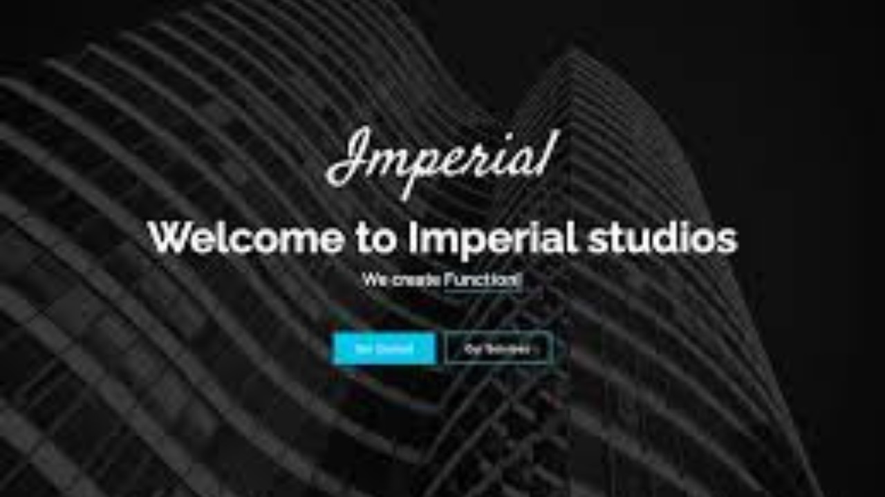
Step 3: Hero Section
The Hero Section is an attention-grabbing part of your website that typically features a large background image or video with a strong headline and call-to-action (CTA). Here’s an example:
html<section id="home" class="hero bg-primary text-white text-center py-5">
<div class="container">
<h1 class="display-3">Welcome to Imperial</h1>
<p class="lead">We build innovative solutions that drive results and growth for your business.</p>
<a href="#services" class="btn btn-light btn-lg">Explore Our Services</a>
</div>
</section>
In this example, the Hero Section uses a bold headline and an eye-catching button that encourages users to explore more about your services.
Step 4: About Section
The About Section is where you can introduce your business and explain what you do. It gives potential customers a better understanding of your values and services. Here’s an example:
html<section id="about" class="about py-5">
<div class="container">
<h2 class="text-center">About Us</h2>
<p class="lead text-center">Imperial is a leading digital agency with a focus on delivering high-quality web solutions. Our team of experts works closely with clients to craft tailored solutions that drive growth and innovation.</p>
</div>
</section>
This About Section uses a brief description of your company’s mission and goals, giving visitors the confidence to trust your business.
Step 5: Services Section
The Services Section highlights what you offer to potential clients. It's essential to showcase your skills and services clearly. Here’s an example:
html<section id="services" class="services py-5">
<div class="container">
<h2 class="text-center">Our Services</h2>
<div class="row">
<div class="col-md-4">
<div class="service-card">
<h5>Web Design</h5>
<p>Our web design team focuses on creating visually appealing and highly functional websites tailored to your brand.</p>
</div>
</div>
<div class="col-md-4">
<div class="service-card">
<h5>Web Development</h5>
<p>We specialize in building responsive and scalable websites using the latest development technologies.</p>
</div>
</div>
<div class="col-md-4">
<div class="service-card">
<h5>SEO Optimization</h5>
<p>Our SEO services help improve your search engine rankings, bringing more visibility and traffic to your website.</p>
</div>
</div>
</div>
</div>
</section>
This Services Section is divided into three columns, each representing a different service, with clear titles and descriptions.
Step 6: Portfolio Section
A Portfolio Section is essential for showcasing your past projects and work. This section allows visitors to see examples of what you can do. Here’s an example:
html<section id="portfolio" class="portfolio py-5">
<div class="container">
<h2 class="text-center">Our Portfolio</h2>
<div class="row">
<div class="col-md-4">
<img src="images/project1.jpg" class="img-fluid" alt="Project 1">
<h5 class="text-center mt-2">Project 1</h5>
</div>
<div class="col-md-4">
<img src="images/project2.jpg" class="img-fluid" alt="Project 2">
<h5 class="text-center mt-2">Project 2</h5>
</div>
<div class="col-md-4">
<img src="images/project3.jpg" class="img-fluid" alt="Project 3">
<h5 class="text-center mt-2">Project 3</h5>
</div>
</div>
</div>
</section>
This Portfolio Section uses a grid layout to showcase different projects, each with an image and a title. You can replace these with images of your own projects.
Step 7: Contact Section
The Contact Section allows potential clients or visitors to reach out to you. It typically includes a contact form and other contact information. Here’s an example:
html<section id="contact" class="contact bg-light py-5">
<div class="container">
<h2 class="text-center">Contact Us</h2>
<form>
<div class="form-group">
<label for="name">Your Name</label>
<input type="text" class="form-control" id="name" placeholder="Enter your name">
</div>
<div class="form-group">
<label for="email">Your Email</label>
<input type="email" class="form-control" id="email" placeholder="Enter your email">
</div>
<div class="form-group">
<label for="message">Your Message</label>
<textarea class="form-control" id="message" rows="4" placeholder="Enter your message"></textarea>
</div>
<button type="submit" class="btn btn-primary">Send Message</button>
</form>
</div>
</section>
This Contact Form allows visitors to enter their name, email, and message. You can also add social media links or your physical address if needed.
Step 8: Footer Section
The Footer Section usually contains copyright information, links to privacy policies, and social media icons. Here's a simple example:
html<footer class="footer bg-dark text-white py-4">
<div class="container">
<div class="row">
<div class="col-md-6">
<p>© 2025 Imperial. All rights reserved.</p>
</div>
<div class="col-md-6 text-right">
<a href="#" class="text-white">Privacy Policy</a> | <a href="#" class="text-white">Terms of Service</a>
</div>
</div>
</div>
</footer>
This Footer Section includes basic legal links and copyright information, ensuring that your website remains professional and fully compliant.
Conclusion
The Imperial Bootstrap Template is a well-designed, responsive template that is perfect for businesses, agencies, and portfolios. It’s easy to set up, highly customizable