Free Download Impact Bootstrap Template | asadmukhtar.info
Step-by-Step Guide to Setting Up Authentication in Laravel 12 with Breeze   |   Manual Authentication in Laravel 12: Step-by-Step Guide   |   How to Build a REST API in Laravel 12 with Sanctum   |   Laravel 12 CRUD Application with Image Upload   |   Laravel 12 Multi-Auth System: Admin & User Login   |   How to Integrate Stripe Payment Gateway in Laravel 12   |   Building a Role-Based Access Control (RBAC) in Laravel 12   |   How to Use Laravel 12 Queues and Jobs for Background Tasks   |   Laravel 12 Livewire CRUD Example with Validation   |   Email Verification and Password Reset in Laravel 12   |   How to Use Laravel 12 API with Vue.js 3   |   Laravel 12 AJAX CRUD with jQuery and Bootstrap   |   Laravel 12 Multi-Language Website Setup   |   React Best Practices for 2025: Performance, SEO, and Scalability   |   How to Build a Full-Stack MERN App: A Step-by-Step Guide   |   React State Management: Redux vs. Context API vs. Recoil   |   Server-Side Rendering (SSR) in React with Next.js for SEO   |   How to Optimize React Apps for Faster Load Times   |   Building a REST API with Node.js and Express for a React App   |   Integrating JWT Authentication in React and Node.js (MERN Stack)   |   Real-time Chat App with React, Node.js, and Socket.io   |   How to Deploy a MERN Stack Application on AWS or Vercel   |   Connecting React Frontend to a Node.js Backend with Axios   |   Laravel Implement Flash Messages Example   |   How to integrate Angular 19 with Node.js and Express for full-stack development   |   Best practices for connecting Angular 19 frontend with Laravel API   |   Step-by-step guide to upgrading an existing project to Angular 19   |   How to implement authentication in Angular 19 using JWT and Firebase   |   Optimizing server-side rendering in Angular 19 with route-level render modes   |   Using Angular 19 signals for state management in large applications   |   How to create standalone components in Angular 19 for modular architecture   |   Building a CRUD application in Angular 19 with MongoDB and Express   |   Implementing lazy loading in Angular 19 to improve performance   |   How to integrate Angular 19 with GraphQL for efficient data fetching   |   Vue 3 Composition API vs Options API: A Comprehensive Comparison   |   Fetching and Displaying Data from APIs in Vue.js with Axios   |   Building a Todo App in Vue.js with Local Storage Integration   |   Handling Forms and Validation in Vue.js Using VeeValidate   |   State Management in Vue.js Applications Using Vuex   |   10 Most Important Tasks Every MERN Stack Developer Should Master   |   How to Build a Full-Stack CRUD App with MERN Stack   |   Best Practices for Authentication & Authorization in MERN Stack   |   1. MEAN Stack vs. MERN Stack: Which One Should You Choose in 2025   |   Top 10 Node.js Best Practices for Scalable and Secure Applications   |   How to Build a REST API with Laravel and Node.js (Step-by-Step Guide)   |   Mastering Angular and Express.js for Full-Stack Web Development   |   Top 10 Daily Tasks Every Frontend Developer Should Practice   |   Essential Backend Development Tasks to Boost Your Coding Skills   |   Real-World Mini Projects for Practicing React.js Daily   |   Laravel Developer Task List: Beginner to Advanced Challenges   |   How to Assign Effective Tasks to Your Intern Developers   |   10 Must-Try Tasks to Master JavaScript Fundamentals   |   Practical CSS Challenges That Improve Your UI Design Skills   |   Top Tasks to Learn API Integration in React and Angular   |   Best Task Ideas for a 30-Day Web Development Challenge   |   Top Git and GitHub Tasks Every Developer Should Know   |   30-Day Task Plan for Web Development Interns   |   Weekly Task Schedule for Junior Developers in a Startup   |   How to Track Progress with Development Tasks for Interns   |   What Tasks Should You Give to Interns in a MERN Stack Project   |   Build These 5 Projects to Master React Routing   |   Task-Based Learning: Become a Full-Stack Developer in 90 Days   |   Daily Coding Tasks That Will Sharpen Your Logical Thinking   |   Top 7 Backend Task Ideas to Practice With Node.js and MongoDB   |  

Free Download Impact Bootstrap Template

Free Download Impact Bootstrap Template

The Impact Bootstrap Template is a modern, responsive, and sleek design framework built with the Bootstrap front-end toolkit. It is perfect for creating visually appealing websites with a professional, clean, and minimalistic look.

Introduction to Impact Bootstrap Template

The Impact Bootstrap Template is a modern, responsive, and sleek design framework built with the Bootstrap front-end toolkit. It is perfect for creating visually appealing websites with a professional, clean, and minimalistic look. Whether you're building a business website, portfolio, or personal blog, the Impact template offers powerful and customizable design options that are mobile-friendly and easy to implement.

This guide will explain how to implement the Impact Bootstrap Template step-by-step, allowing you to create a feature-rich website using Bootstrap's responsive layout and predefined styles. Follow this easy-to-follow guide to get started with the Impact Bootstrap Template for your next project.


Steps to Implement Impact Bootstrap Template

Here’s a simple, step-by-step guide to implementing and customizing the Impact Bootstrap Template.

Step 1: Download or Import the Bootstrap Template

The first step in using the Impact Bootstrap Template is to download the template files or import the necessary Bootstrap CDN links for your WordPress theme.

  1. Option 1: Download the Template
    Go to a reliable Bootstrap theme provider or theme repository and download the Impact Template (you can find such templates on platforms like Start BootstrapBootstrapMade, or ThemeWagon).

  2. Option 2: Use Bootstrap CDN
    If you're not using a pre-built template but still want to get the Impact look with Bootstrap, you can integrate the Bootstrap framework using the CDN links in your WordPress header.php file.

html
<!-- Bootstrap CSS --> <link href="https://stackpath.bootstrapcdn.com/bootstrap/4.5.2/css/bootstrap.min.css" rel="stylesheet"> <!-- Bootstrap JS --> <script src="https://stackpath.bootstrapcdn.com/bootstrap/4.5.2/js/bootstrap.bundle.min.js"></script>

After adding this code, your website will be ready to use Bootstrap's styles and components.

Step 2: Create the Basic Layout

Now that Bootstrap is integrated into your WordPress site, you can use the Impact Bootstrap Template's layout to start designing the page structure.

  1. Header Section with Navigation Bar
    The Impact template usually includes a modern navigation bar. In your header.php file, you can use Bootstrap’s Navbar component to create a responsive, sticky header.
php
<nav class="navbar navbar-expand-lg navbar-light bg-light fixed-top"> <a class="navbar-brand" href="#">Impact</a> <button class="navbar-toggler" type="button" data-toggle="collapse" data-target="#navbarNav" aria-controls="navbarNav" aria-expanded="false" aria-label="Toggle navigation"> <span class="navbar-toggler-icon"></span> </button> <div class="collapse navbar-collapse" id="navbarNav"> <ul class="navbar-nav ml-auto"> <li class="nav-item"> <a class="nav-link" href="#home">Home</a> </li> <li class="nav-item"> <a class="nav-link" href="#about">About</a> </li> <li class="nav-item"> <a class="nav-link" href="#services">Services</a> </li> <li class="nav-item"> <a class="nav-link" href="#contact">Contact</a> </li> </ul> </div> </nav>

In this code:

  • navbar-expand-lg makes the navbar responsive.
  • fixed-top ensures that the navbar stays fixed at the top as users scroll.
  • ml-auto aligns the navigation items to the right.
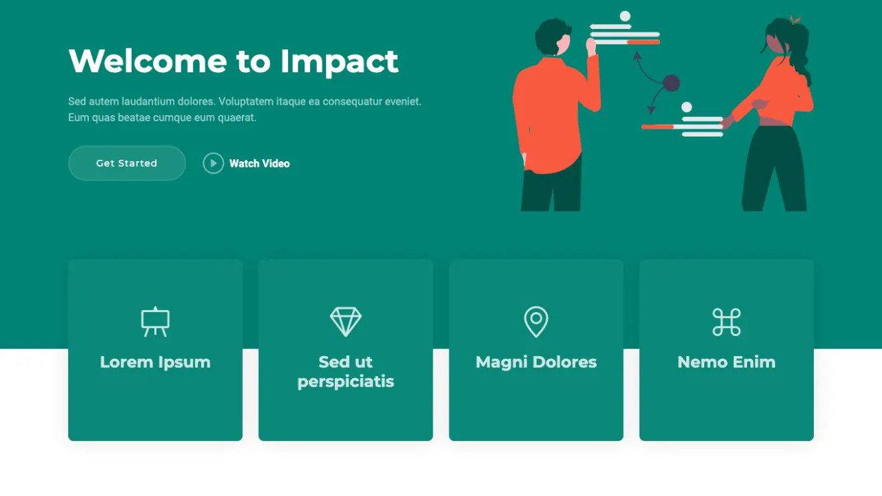
  1. Hero Section
    hero section in the Impact template usually includes a large, attention-grabbing background image and a call-to-action (CTA) button.
php
<section id="home" class="hero bg-primary text-white text-center py-5"> <div class="container"> <h1 class="display-3">Welcome to Impact</h1> <p class="lead">Create something amazing with the Impact Bootstrap Template</p> <a href="#about" class="btn btn-light btn-lg">Learn More</a> </div> </section>

Here:

  • bg-primary sets a background color.
  • text-white ensures the text is white on top of the dark background.
  • py-5 adds padding to the top and bottom.

Step 3: Add Sections for Content

Once you have the header and hero section in place, you can start adding content sections to your page like About UsServices, and Contact.

  1. About Section
php
<section id="about" class="about py-5"> <div class="container"> <div class="row"> <div class="col-lg-6"> <h2>About Us</h2> <p>Lorem ipsum dolor sit amet, consectetur adipiscing elit. Proin ac justo nec dui placerat lacinia.</p> </div> <div class="col-lg-6"> <img src="images/about-image.jpg" class="img-fluid" alt="About Image"> </div> </div> </div> </section>

This is a simple two-column section that uses Bootstrap’s grid system to display text and an image side-by-side.

  1. Services Section
php
<section id="services" class="services bg-light py-5"> <div class="container"> <h2 class="text-center">Our Services</h2> <div class="row"> <div class="col-md-4"> <div class="card"> <img src="images/service1.jpg" class="card-img-top" alt="Service 1"> <div class="card-body"> <h5 class="card-title">Service 1</h5> <p class="card-text">Description of service 1 goes here.</p> </div> </div> </div> <div class="col-md-4"> <div class="card"> <img src="images/service2.jpg" class="card-img-top" alt="Service 2"> <div class="card-body"> <h5 class="card-title">Service 2</h5> <p class="card-text">Description of service 2 goes here.</p> </div> </div> </div> <div class="col-md-4"> <div class="card"> <img src="images/service3.jpg" class="card-img-top" alt="Service 3"> <div class="card-body"> <h5 class="card-title">Service 3</h5> <p class="card-text">Description of service 3 goes here.</p> </div> </div> </div> </div> </div> </section>

This section uses Bootstrap cards to display individual services. The grid system (col-md-4) ensures that the columns will stack on smaller devices.

Step 4: Add the Footer

The footer section in the Impact template provides a clean, simple design to end your page.

php
<footer class="bg-dark text-white py-4"> <div class="container"> <div class="row"> <div class="col-md-6"> <p>&copy; <?php echo date('Y'); ?> Impact. All Rights Reserved.</p> </div> <div class="col-md-6 text-md-right"> <ul class="list-inline"> <li class="list-inline-item"><a href="#" class="text-white">Privacy</a></li> <li class="list-inline-item"><a href="#" class="text-white">Terms</a></li> <li class="list-inline-item"><a href="#" class="text-white">Contact</a></li> </ul> </div> </div> </div> </footer>

This footer is a simple dark-themed footer with copyright information and a list of links.


Final Words

The Impact Bootstrap Template offers a solid foundation for building beautiful, mobile-friendly websites with ease. By following the above steps, you can seamlessly integrate it into your WordPress website, using its flexible grid system, components, and utilities.

  • Responsive Design: The layout is fully responsive, ensuring your website looks great on all screen sizes.
  • Easy to Customize: You can easily tweak the design, replace content, and add new sections.
  • Mobile-First: With Bootstrap’s mobile-first approach, your site is optimized for smartphones and tablets.

Whether you're a beginner or an experienced developer, integrating the Impact Bootstrap Template into your WordPress theme is a powerful way to enhance your website’s user experience and aesthetics