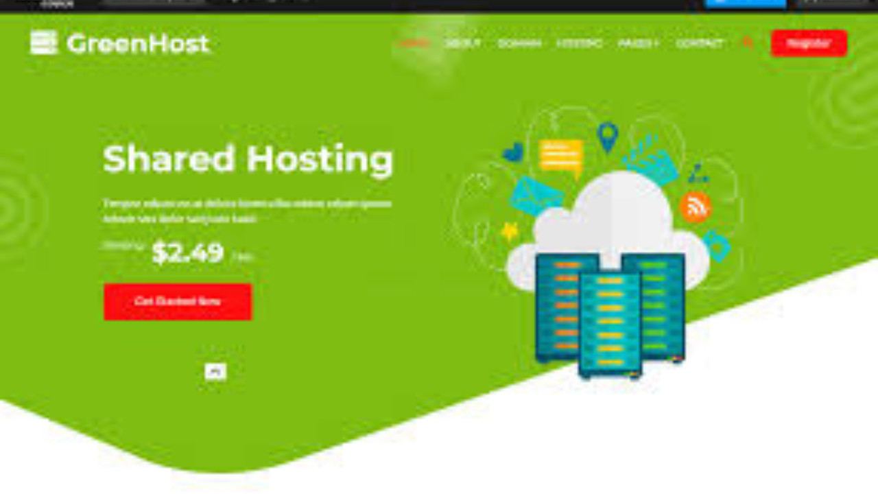
Introduction to Green Bootstrap Template
The Green Bootstrap Template is a modern, eco-friendly, and fully responsive website template designed using the popular Bootstrap framework. With its fresh green design elements, it is perfect for businesses and organizations focused on sustainability, environmental issues, or eco-conscious brands. This template is clean, lightweight, and customizable, providing a simple yet elegant solution for your online presence.
Step-by-Step Guide to Customizing the Green Bootstrap Template
The Green Bootstrap Template comes with multiple sections that can be easily customized for various needs. Whether you're a green business, an NGO, or an individual looking to promote eco-friendly initiatives, this template offers a perfect starting point. Below is a step-by-step guide to help you personalize your website.
Step 1: Download and Set Up the Template
1. Download the Template
To begin, download the Green Bootstrap Template from a trusted source such as BootstrapMade, Start Bootstrap, or other template marketplaces. After downloading, you will get a .zip file.
2. Extract the Files
Once the download is complete, extract the .zip file into a folder on your computer. Inside, you will find essential files like HTML files, CSS, JavaScript, and images.
3. Open the Template
Open the index.html file in your web browser to see the default preview of the template. The Green Bootstrap Template will be ready for you to customize and personalize according to your needs.
Step 2: Customizing the Navigation Bar
The navigation bar of the Green Bootstrap Template is designed to be simple, responsive, and user-friendly. Here’s an example of the code for the navigation bar:
html<nav class="navbar navbar-expand-lg navbar-dark bg-success fixed-top">
<a class="navbar-brand" href="#">Green Solutions</a>
<button class="navbar-toggler" type="button" data-toggle="collapse" data-target="#navbarNav" aria-controls="navbarNav" aria-expanded="false" aria-label="Toggle navigation">
<span class="navbar-toggler-icon"></span>
</button>
<div class="collapse navbar-collapse" id="navbarNav">
<ul class="navbar-nav ml-auto">
<li class="nav-item active">
<a class="nav-link" href="#home">Home</a>
</li>
<li class="nav-item">
<a class="nav-link" href="#about">About</a>
</li>
<li class="nav-item">
<a class="nav-link" href="#services">Services</a>
</li>
<li class="nav-item">
<a class="nav-link" href="#contact">Contact</a>
</li>
</ul>
</div>
</nav>
This Navigation Bar uses the green color palette to stay in line with the eco-friendly theme. You can modify the brand name, add more menu items, or customize the colors further by editing the CSS file.
Step 3: Hero Section
The Hero Section is the first impression visitors will have of your website, so it should be eye-catching and convey your message clearly. Here is an example:
html<section id="home" class="hero bg-success text-white text-center py-5">
<div class="container">
<h1 class="display-4">Welcome to Green Solutions</h1>
<p class="lead">Committed to building a sustainable future for all.</p>
<a href="#services" class="btn btn-light btn-lg">Our Services</a>
</div>
</section>
In this Hero Section, you have a strong headline, a brief description, and a call-to-action button that directs visitors to the Services Section. Feel free to change the background color, text, and button text according to your preferences.
Step 4: About Section
The About Section is where you can provide more information about your company or the mission behind your website. Here’s an example of a simple About Section:
html<section id="about" class="about py-5">
<div class="container">
<h2 class="text-center">About Us</h2>
<p class="lead text-center">We are a company dedicated to sustainable practices, offering solutions that help preserve our planet for future generations. Our team is passionate about reducing the environmental impact through innovative ideas and actions.</p>
</div>
</section>
This About Section provides a brief overview of the organization’s mission and values. You can add more content like team members, history, or achievements.
Step 5: Services Section
The Services Section is where you can display what your business or organization offers. It is essential to break down your services in a clear, easy-to-understand way. Below is an example:
html<section id="services" class="services py-5">
<div class="container">
<h2 class="text-center">Our Services</h2>
<div class="row">
<div class="col-md-4">
<div class="service-card">
<h5>Eco Consulting</h5>
<p>We offer expert consulting services to help businesses reduce their environmental footprint and implement green practices.</p>
</div>
</div>
<div class="col-md-4">
<div class="service-card">
<h5>Recycling Solutions</h5>
<p>We provide recycling solutions for businesses and communities, promoting a circular economy.</p>
</div>
</div>
<div class="col-md-4">
<div class="service-card">
<h5>Green Energy Solutions</h5>
<p>Our green energy solutions help businesses transition to renewable energy sources, reducing their carbon footprint.</p>
</div>
</div>
</div>
</div>
</section>
This Services Section breaks down the services into three distinct categories. You can expand this section to include more services or adjust the layout as needed.
Step 6: Contact Section
The Contact Section allows visitors to get in touch with you. A simple contact form is an excellent way for users to send inquiries. Below is an example:
html<section id="contact" class="contact bg-light py-5">
<div class="container">
<h2 class="text-center">Contact Us</h2>
<form>
<div class="form-group">
<label for="name">Your Name</label>
<input type="text" class="form-control" id="name" placeholder="Enter your name">
</div>
<div class="form-group">
<label for="email">Your Email</label>
<input type="email" class="form-control" id="email" placeholder="Enter your email">
</div>
<div class="form-group">
<label for="message">Your Message</label>
<textarea class="form-control" id="message" rows="4" placeholder="Enter your message"></textarea>
</div>
<button type="submit" class="btn btn-success">Send Message</button>
</form>
</div>
</section>
The Contact Form includes fields for name, email, and a message. You can customize the fields and form submission actions as needed.
Step 7: Footer Section
The Footer Section usually contains important information like copyright, legal links, or social media icons. Below is an example:
html<footer class="footer bg-dark text-white py-4">
<div class="container">
<div class="row">
<div class="col-md-6">
<p>© 2025 Green Solutions. All rights reserved.</p>
</div>
<div class="col-md-6 text-right">
<a href="#" class="text-white">Privacy Policy</a> | <a href="#" class="text-white">Terms of Service</a>
</div>
</div>
</div>
</footer>
This Footer Section includes copyright information and links to privacy policies and terms of service.
Conclusion
The Green Bootstrap Template offers a clean, modern, and professional layout that is perfect for eco-friendly businesses, sustainability projects, or green initiatives. With its simple yet effective design, it’s easy to customize the template for your brand. By following the steps outlined above, you can set up a fully functional, responsive, and aesthetically pleasing website that reflects your eco-conscious values and goals